MLB 2K10 News Post
Major League Baseball 2K10 Videos
Member Comments
The game looked very playable to me. You can tell they put some work into it. I do not obsess over the graphics as I am more interested in game play.
A couple observations:
Pro:
-Really liked that hit by Byrd when he reached and went the other way. Was that the product of a defensive swing?
-Like the variability with the batter strike zone sizes. That is one thing I would like to see implemented in the Show.
-I like how the batters take their time getting set in the batter's box before the pitch. They are not immediately set in their stance.
-The mix of pitches from the CPU pitcher was good and he even gave up a walk. Nice to see!
Cons for me:
-I am not a fan of the hitter's eye. It shows up way too often. I know the easy fix is to turn it off.
-Not understanding the throwing animations. The throws that the fielders are getting off are not reflective in their throwing animation. Also the arcs are really exaggerated too much like a rainbow.
-I am concerned that they took away the adjustable camera for hitting as that view is the only one we have seen. I keep wanting to peek up over the strike zone.
It is just one inning of play so we really need a full game to see the overall game AI but I did not think things were too far off like last year.
Here are the positives I saw in the video:
- Something I've always wanted is for the pitcher to come set after I select the pitch type (ala The Show). It's finally in! Select the pitch type, pitcher comes set and will freeze until you begin the gesture. Great for when runners are on base.
- I love the new base runners windows. Hated last year's stick figures!
- I did not see one Pepsi / State Farm ad. Did 2K lose those sponsorships? I did see a bunch of generic advertising (Foenix Airlines? Bright Shield Insurance?).
I'll hold off on my negative thoughts until I see more gameplay videos. I had a hard time viewing this video because it came in very choppy for me.
BigBlue
# 104
ExtremeGamer @ 02/19/10 07:39 AM
I thought it looked great. Just want a playable baseball game, and it looks at least playable.
|
|||||||||||||
|
Personally, I'm VERY happy with what I see from this game.
I do share the concerns with the animation speeding up/down, but it looks to be a MUCH more playable version this time around.
PC might have a decent MLB game again!
For the record, I really like that new batting camera.
I do share the concerns with the animation speeding up/down, but it looks to be a MUCH more playable version this time around.
PC might have a decent MLB game again!
For the record, I really like that new batting camera.
# 107
WaddupCouzin @ 02/19/10 10:19 AM
I don't think the pick-off play looks that bad, sometimes you have to dive back into first base depending on your lead, but I do hope they have varied get back to the bag animations. Only having one type wouldn't be cool.
|
|||||||||||||
|
Well off the bat, the first issue is the video being down-converted from sixty frames per second when it was uploaded. Sometimes you're watching swings and it looks like you don't even see the bat go through the zone. That should be better ironed out when you watch it on your own TV.
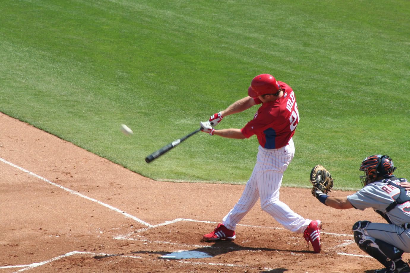
The second issue is partly a swing issue that you'll see from baseball players in real life, but I think it's a bit exaggerated to the point that it doesn't quite seem physically possible. The issue is the wrist roll-over coming way too early in the swing. I think we're seeing it about during the contact point, which as most baseball players should understand is a huge no-no. A batter normally gets themselves "squared" to the pitcher by their pivot opening up their hips, so that way when they start their hands at the ball, the torque will open up their bat facing as well. For most of your swing, your bat will actually kind of stay along the same plane rather than getting a completely perfect arch-swing like Griffey's shoes show. And, at the point of contact, you should be well behind the ball (normally as a result of your weight being back). See here:

You can tell that his wrists yet haven't rolled over because his left wrist is still facing palm-up and his right wrist is palm-down. The normal "roll-over" point for a baseball player is when they extend the bat head out pointed toward the pitcher or the side of the field which they bat:

(notice this is when his wrists are finally rolling over, and palm facings are switching roles)
For one-handed swingers, this is also the earliest point they will let go with their top hand, because they don't want to have to roll over and carry through with their swing.
So in MLB 2K10 (and you can really see it in the Hitters video where Longoria doubles down the line), it seems the hip rotation moves independently with the hand movement. He'll get his pivot through, but not square up to the pitcher; then to get his arms around, you'll see that he rolls over around the point of contact and lets go of the bat shortly after that, then finish his hip opening when he follows through and lets go of the bat to run down the line.
Speaking of follow-throughs, that's the third issue. I don't really think I need to explain it, but they look awkward. They especially look bad on swings and misses when they do that helicopter thing. Not all of these hitters are Matt Williams, so I don't know why they're all doing it. It just looks weird is all.
So I just hope that it explains what's going on here. Again, take this as only a lesson from a hitting coach explaining some of the fundamentals of a swing, and how this is not only fundamentally incorrect, but almost physically impossible to separate body motion and flow with your hand gestures.
EDIT: Sorry if that Utley pic enlarges on you. I'll try and find a smaller picture to use.
# 109
GhostWriter99 @ 02/19/10 10:38 AM
As a x-box 360 only owner, I have no choice but to get the game. Well I guess I do have a choice but I need a Baseball game and this has to be it.
The video is ok I guess.
I really like the batters camera, I think this could allow more people to bring more high counts into a game. I loved the way Wrigley looked. I am not really too upset with the numbers but I can see what everyone is complaining about. I like the wildness of Oliver Perez, that will teach you patience because if you swing at those pitches you will get in trouble.
No too crazy about the quick inning in the top half. The fans didn't seem too realistic to me. Fielding seemed really fast. The "Play of the day" comment after the double play I did not like at all. A run scored and they acted like he did a good thing by hitting into a double play, I am not sure how easy that is to correct but still.
Overall I am not too dissapointed and am still on pace to getting the game the day of release (x-box 360 only owner). I am hoping more gameplay videos are coming so I can see some more to get a better idea of what to expect.
Holy crap Blzer! Nice breakdown. You always find a way to get technical lol.
Lots of potential there! The signature style is once again on top of its game.
# 112
playball335 @ 02/19/10 10:56 AM
I hate the fact (I know it's trivial) that all the names on the back of the jerseys are the same font. It's this lack of attention to detail that really bugs me with 2K. Along with the crippling bugs that always seem to plague franchise mode year after year. I am really hoping they have finally gotten things right.
I am really hoping for a pc baseball fix!
I am really hoping for a pc baseball fix!
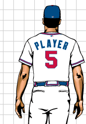
There's a lot of talk over at the 2k Forum (by Ronnie) that the reason for the abnormally large uniform elements such as the numbers and logos is due to the specs in the MLB Style Guide provided to them. As an Art Director for a TV company who has in the past done work for MLB, has access to the official MLB online style guide, and is a loyal uniwatchblog.com member... I can tell you that is 100% false. It's just poor design, plain and simple. I thought the numbers looked fine last year, and I don't know what prompted the change. Perhaps something to do with altering the player models caused the the old uni files not to work? Who knows.
I like the way the game looks and I'm excited to pick this up day 1, but the uniform thing hits a certain nerve in me that's hard to ignore.
Here's an example of an older style guide image for a Braves jersey. Notice the number size. The grid in the background is used to measure scale. I can't go posting images from the official style guide, as MLB prohibits people from displaying images with out... you guessed it, "expressed written consent from the office of the commissioner.. etc etc" but I found this one online that is a smaller cropped version of what we get in the big PDF from MLB.

# 114
Trevytrev11 @ 02/19/10 11:41 AM
|
|||||||||||||
|
|
|||||||||||||
|

|
|||||||||||||
|
This is what kills me about 2K's 'secrecy' about not releasing video sooner. I'm pretty sure that someone who had access to an early build of the game brought this issue to their attention. I mean, if it's that obvious, don't you think that 2K would have done something about it sooner?
Instead, 2K goes on the defensive about MLB Style Guidelines. This seems to be a simple artistic fix that 'fell by the wayside' in order to shore up the issues that plagued this game over the last few years. If that's the case, then 2K needs to admit this. But to 'defend' it is arrogant of them.
Realistically, how much time and resources would it have taken to correct this issue, 2K? It's always something with this game. Instead of hearing about the true positives and negatives of the 1-inning gameplay video that 2K approved of for release, we're moaning about the gigantic numbers on the back of players' jerseys.
2K just can't get this thing right, man. WAKE UP, 2K! WAKE UP!
BigBlue
|
|||||||||||||
|
They can be fined PER incident, I believe. That could be some big bucks.
Perhaps they are indeed following the guide...but however they apply the design onto the uni and then onto the player model...it's being distorted?...
M.K.
Knight165
|
|||||||||||||
|
# 120
Trevytrev11 @ 02/19/10 12:10 PM
|
|||||||||||||
|
It'd be kind of like if they dirt circle that surrounded the pitching mound was twice the diameter that it is. Likely it wouldn't impact the game, but the whole time you're playing, you're thinking to your self, "man, that just looks bad. how did they not see that?"
Post A Comment


 08:00 PM - February 18, 2010 by King Gro23


