Home
NCAA Football 11 News Post

EA has just posted another NCAA Football 11 blog. Jean Adams, the Art Director talks about a couple of graphic improvements; the first being linear lighting.

Quote:
"Without getting too much into the art/technical details, we wanted to talk about a couple of graphic improvements; the first being linear lighting. This lighting technique allows us to more accurately control the material properties of everything that makes up the player. To put it in basic terms, we now have control over how bright or dark things get without losing detail. It also helps us get the authentic color on the uniforms.

Linear lighting also allows us to tune helmets, jerseys, and other player gear in a much more realistic way. For example; you’ll notice the skin looks more lifelike and less like plastic. Helmets and jerseys reflect the right amount of light. Colors are less saturated and react to lighting in a more realistic way. You might remember looking at previous versions of NCAA Football and feeling like things were too saturated and flat. We think we’ve addressed these issues thanks to this new level of control."

NCAA Football 11 screenshot gallery - Click to view NCAA Football 11 screenshot gallery - Click to view
Game: NCAA Football 11Reader Score: 8/10 - Vote Now
Platform: iPhone / PS2 / PS3 / Xbox 360Votes for game: 83 - View All
NCAA Football 11 Videos
Member Comments
# 1 drlw322 @ 03/25/10 05:07 PM
thanks to Hova 57 letting us know.

http://ncaafootball.easports.com/blog.action


Screens and Lighting
by Russ 03/25/10 3:40 PM

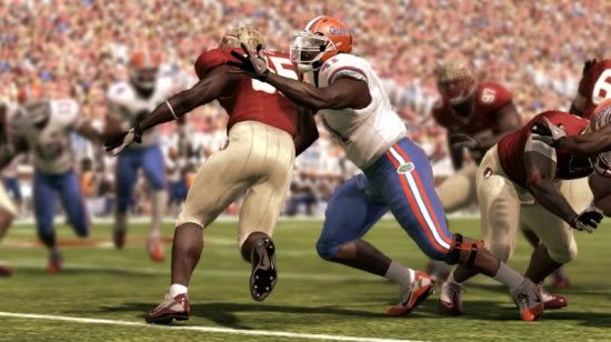
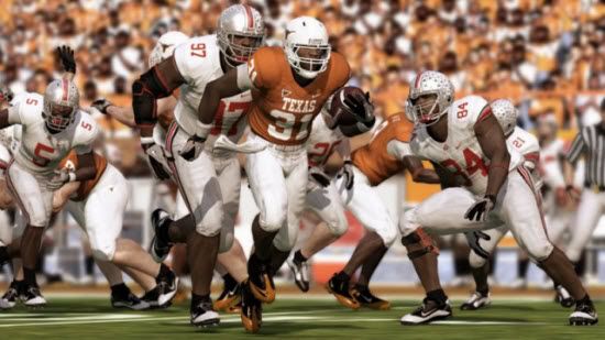
Here we are now just a short 4 months away from our July release date and busy as can be here at Tiburon. There were a few questions about whether our first screenshot was actually in-game or not, so I sat down with Jean Adams – Art Director on NCAA Football 11 – to talk about why the game looks better this year. We hope this blog will shed some light on the situation… (That is easily the worst pun I’ve ever had in my life).

Without getting too much into the art/technical details, we wanted to talk about a couple of graphic improvements; the first being linear lighting. This lighting technique allows us to more accurately control the material properties of everything that makes up the player. To put it in basic terms, we now have control over how bright or dark things get without losing detail. It also helps us get the authentic color on the uniforms.

Linear lighting also allows us to tune helmets, jerseys, and other player gear in a much more realistic way. For example; you’ll notice the skin looks more lifelike and less like plastic. Helmets and jerseys reflect the right amount of light. Colors are less saturated and react to lighting in a more realistic way. You might remember looking at previous versions of NCAA Football and feeling like things were too saturated and flat. We think we’ve addressed these issues thanks to this new level of control.

Jean is also a big into gear so he wanted me to point out the leg brace, Nike Jet gloves and the Air LT cleats

Overall we wanted to make lighting feel realistic and dramatic at the same time. At the end of the day we are hoping that you like the crisp and detailed graphics of NCAA Football 11.

Here is a comparison of NCAA Football 10...

and NCAA Football 11.

We think graphics are key, but before you ask… YES, there are bigger details coming on gameplay and Dynasty, so please be patient. In a couple weeks we are scheduled to release the first gameplay feature blog. I think you are going to like it; really cool stuff, no question about it.

Thanks for reading!


Photobucket


Photobucket


# 2 BLACKjersey53 @ 03/25/10 05:13 PM
skin is less shiny, nice! also love all of the new epuipment
 
# 3 KyGamerLT @ 03/25/10 05:18 PM
O H I O man I can't wait.
 
# 4 drlw322 @ 03/25/10 05:19 PM
in the texas vs ohio st pic, it looks like it looks like it's displaying a different running animation on the texas running back. also all the other player looks like they are leaning more like momentum is involved.

is it me or are these Ncaa Screens kicking the Madden one's a@@
 
# 5 Kevin26385 @ 03/25/10 05:22 PM
It's amazing how much lighting makes the game look much better.
 
# 6 sva91 @ 03/25/10 05:23 PM
This has become a first day purchase just based on the UT Ohio St pic alone. The graphics, gear, lighting look incredible. I swear if I were to have seen that first pic on SI or something without staring at it, I would have guessed it was real. INSANE!!

I know its not all about graphics, but with a game looking this nice, you can easily overlook some of the core deficiencies. Kinda like dating a supermodel.
 
# 7 JohnDoe8865 @ 03/25/10 05:26 PM
Very nice.
 
# 8 BSherrod @ 03/25/10 05:32 PM
Wow...that looks good. Nice to see the Vapor Jets in the game and the other new equipment. Was the high socks option in last year's game? I haven't played on next gen in awhile and in the background of the Florida/Florida State screen one player has different sock length.
 
# 9 BLACKjersey53 @ 03/25/10 05:34 PM
Love the screenshot, but I wouldnt mind if EA gave us more screenshots...ya know, as something to keep people like me occupied until another blog comes out.
 
# 10 J-Unit40 @ 03/25/10 05:40 PM
Quote:
Originally Posted by sva91
This has become a first day purchase just based on the UT Ohio St pic alone. The graphics, gear, lighting look incredible. I swear if I were to have seen that first pic on SI or something without staring at it, I would have guessed it was real. INSANE!!

I know its not all about graphics, but with a game looking this nice, you can easily overlook some of the core deficiencies. Kinda like dating a supermodel.
BOOM!! Exactly. I totally agree with both points.

We will still have some time to find out more about gameplay, locomotion and playbooks in the coming weeks/months, but this is a great start!

Oh, and I see a new running animation/style on the Texas RB.....nice.
 
# 11 Drocks @ 03/25/10 05:44 PM
Quote:
Originally Posted by Sting
Looks the same except for some new equipment.
Really? I thought it looked a lot better, more realistic coloring to the jerseys and skin tones. I don't think the models changed much at all, but I really don't think those needed a lot of work.
 
# 12 stoncold32 @ 03/25/10 05:45 PM
I've been saying the past 2 years, this game looks too dark and washed out. Hopefully it looks better this year

But the main issue is the crowd looking this way
 
# 13 PantherBeast_OS @ 03/25/10 06:00 PM
The blog was ok. But they have alot of things they can do blogs on. Why this. But good blog anyway.
 
# 14 Solidice @ 03/25/10 06:00 PM
Quote:
Originally Posted by BSherrod
Wow...that looks good. Nice to see the Vapor Jets in the game and the other new equipment. Was the high socks option in last year's game? I haven't played on next gen in awhile and in the background of the Florida/Florida State screen one player has different sock length.
yeah, it's been in since '09 I think(could have been '08 though). it's set by individual player though, not a global team setting. so you would have to edit every single player if you wanted everyone to wear a certain sock length.
 
# 15 Watson @ 03/25/10 06:00 PM
The running on the UT player looks like what you'd get with a fullback powering ahead.

So I take it that trucking animations are actually trucking animations?

If so, very nice EA

Quote:
The blog was ok. But they have alot of things they can do blogs on. Why this.
because it's march
 
# 16 SageInfinite @ 03/25/10 06:02 PM
The cleats really add to the look of the game. Graphics look really nice this year. If I knew the animations looked as good as these screens I'd be excited. Hopefully the presentation is better, but this is EA we're talking about.
 
# 17 Solidice @ 03/25/10 06:07 PM
Quote:
Originally Posted by Sting
Looks the same except for some new equipment.
not to me. It's not a huge difference, but there wasn't any need for a big graphic change, IMO.

first thing I noticed in the comparison is the improved shadowing. the lighting of the colors was the second thing I noticed. then I noticed the equipment stuff. I do like the colored cleats though. better than the default gray or black cleats.
 
# 18 DirtyJerz32 @ 03/25/10 06:18 PM
Wow! very impressive. Can't wait to see more pics and vids.
 
# 19 65South @ 03/25/10 06:23 PM
I agree with SageInfinite that the change in cleats really add to the look of the game. I'm also digging the elbow brace on OSU #97. I can't say that I'm excited by looking at these screens nor discouraged. Graphics were never really the big deal to me with NCAA 10, but the gameplay. I will withhold judgement until we get closer to release and EA hopefully provides us with info and some vids on changes to gameplay.
 
# 20 TracerBullet @ 03/25/10 06:23 PM
I really like the new screens especially when compared to the old. Less shine on the players, The helmets look a lot less dull as do the pants. Hopefully like sage said their are some good animations along with this.

Is Ohio State the only team in the game with a multi-colored chinstrap?
 

« Previous123456789Next »

Post A Comment
Only OS members can post comments
Please login or register to post a comment.