Home
Madden NFL 17 News Post

When playing a franchise mode in any sports game, players often spend much more time navigating menus than on the field playing the actual game. Whether it’s adjusting depth charts, reviewing box scores, catching up on league news, or scouting next year’s crop of draft prospects, the quality of user-interface elements in franchise mode can go a long way in determining how fun -- or frustrating -- it can be.

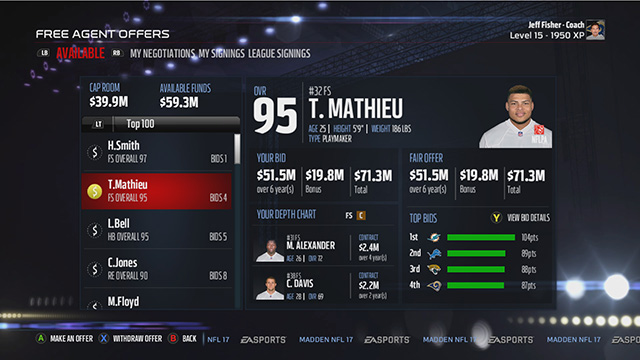
Let’s take a look at seven areas where EA can make positive steps towards building a better experience outside of the lines in franchise mode.

Read More - Seven UI Changes Needed For Madden NFL 18

Game: Madden NFL 17Reader Score: 8/10 - Vote Now
Platform: PS3 / PS4 / Xbox 360 / Xbox OneVotes for game: 17 - View All
Member Comments
# 21 Cardot @ 01/31/17 02:36 PM
Quote:
Originally Posted by D81SKINS
I just don't want the UI to cause other much more important aspects to be left out.
I am fairly confident that the people who work on the UI are different than the ones who work the gameplay.
 
# 22 brandon27 @ 01/31/17 02:40 PM
The change to the big menu tiles this year, especially in CFM was really a mind boggling decision for me. Especially when looking at player progression. Last year, we could just go through what was the usual roster screen to select players, and spend XP. This year, it's the big goofy tiles. It's just a sloppy mess to work with. Keep in simple. It doesn't need to be flashy. It's a franchise mode menu. It needs to be functional.


I think Madden does an incredibly bad job of presenting, and tracking stats inside of franchise mode as well. From errors in calculation and tracking, to the simple presentation of it. It's difficult to work with. We should be able to quickly and easily look back through a player's particular season, game within that season, or even past seasons. Individual games in past seasons may get difficult to store/track, but I think it should still be available to view.


Trading is also difficult to work with. It's not bad once you get into the actual trade screen. However it's incredibly limited. Only three players or picks per team? How do I possibly put a reasonable package together to trade for the #1 overall pick if I wanted to since I'm limited to only 3 resources? Take off the restraints.


The news page is also a mess. For all the reasons mentioned in this article, and then some. The fact you can't click on the tweets and open up more of the story is a bit, odd. The draft news screen is even more maddening. You get tweets there about a certain player having a good performance, or season. No mention though of his team, or his position though sometimes. So, good luck actually finding this guy in your draft class. Then there's the realization that some of the guys mentioned in the draft story, aren't even in the draft class. It's just a puzzling system. It's like someone had a good idea at some point, but the execution was only half there.


I think sometimes they're too focused on making it look flashy. Just... make it functional. Let me execute my tasks quickly, efficiently, and easily. The visual depth chart with the players cards is another example of flash, over function IMO. In theory, great idea. Lays out the depth chart all on once screen, rather than the old way (which is still available) of going position by position. But everytime you select someone within the depth chart, up comes the tile, with the picture etc. That, to me is unnecessary.


I don't necessarily mind the standings page. I get the fact that it defaults to the league, and not your division might be an issue for some, and it is a bit of an inconvenience to have to flip through all the time, but in reality I don't think it's a huge deal.


I think you guessed by now (if you read this far) what my main issue is with the CFM menu's, and it's really EA's game menu's in general. In it's current state, to me it's more about flash, than functionality and substance. I want that reversed. Afterall, if I'm running my franchise I don't care about flashy menu's. I just want the speed, and the ease of getting the information I need. Quickly. Efficiently. Functionality. Depth. Give me the speed, the ease, the functionality, and the depth of historical information, and current season information. Let me get to it, and through it so I can advance the week and get into my next game. This really applies to even their main menu's. Get rid of those big goofy tiles.
 
# 23 howboutdat @ 01/31/17 04:23 PM
One thing sort of for UI , id love to see.This is more about the game menu itself. I dont play other modes, if i do its very rare and a bye week in my league for me so im bored. Id love an option in settings , where we could tell it to just auto load into our CFM, either last used, last advanced, whatever. So instead of having to go to an extra menu screen to get there, it just auto loads from gronk "opening area" straight to my CFM. I know that sounds small but its a very nice touch . GTA does this, you can just load right into online instead of going to offline mode then switch to online. Just let us tell it where to load right to would be a nice touch of functionality to me.
 
# 24 Datninja619 @ 01/31/17 05:00 PM
Agreed on all points. I'd like a trade finder. I put up everyone I want to give away and see who offers up. Trade Block is ideal, but doesn't include picks or package deals.
The season stats needs to be revamped also. As the article said, you can't even see what game the stats are for.
AS for the loading screen, I'd like to also see player match up comparisons. OR news about what people are saying about the game. Overall I will say that presentation is improved this year
 
# 25 DanB_DanB @ 01/31/17 05:36 PM
It just needs to be faster.. Everything takes forever to load. I dont need every tile to do a damn animation. Just get me there
 
# 26 Toupal @ 01/31/17 05:40 PM
Quote:
Originally Posted by Datninja619
Agreed on all points. I'd like a trade finder. I put up everyone I want to give away and see who offers up. Trade Block is ideal, but doesn't include picks or package deals.
The season stats needs to be revamped also. As the article said, you can't even see what game the stats are for.
AS for the loading screen, I'd like to also see player match up comparisons. OR news about what people are saying about the game. Overall I will say that presentation is improved this year
Trade finder at the point seems like a mandatory addition. They only sports game I played for the longest time was Madden. Then the last few years I started playing 2k and the Show, because madden just wasn't doing it for me like it used to.... Those franchise/ dynasty experiences are LIGHTYEARS ahead of where Madden is. Franchise mode took a MASSIVE step backwards in Madden 13, and they are still trying to recover from it.

Madden 17 made a huge step forward IMO, however I feel like they are just scratching the surface of where they need to be. Football is Americas' favorite sport. There is NO excuse that basketball and baseball games should out-perform a game based on the greatest game ever invented.

It is time we start seeing things like:
Trade Finder
Hall of Fame
Custom Draft Classes
Full Editing Ability for create-a-team/ relocation
Assistant Coaches
Dynamic Weather
Dynamic Injuries
Legendary Players
.... The list can go on and on.

Just looking at the Franchise starter screen and seeing the week# take up a quarter of the screen drives me up the wall. I don't know whether it is laziness or what, but I want what other sports games have!
 
# 27 Datninja619 @ 01/31/17 05:47 PM
Quote:
Originally Posted by Toupal
Trade finder at the point seems like a mandatory addition. They only sports game I played for the longest time was Madden. Then the last few years I started playing 2k and the Show, because madden just wasn't doing it for me like it used to.... Those franchise/ dynasty experiences are LIGHTYEARS ahead of where Madden is. Franchise mode took a MASSIVE step backwards in Madden 13, and they are still trying to recover from it.

Madden 17 made a huge step forward IMO, however I feel like they are just scratching the surface of where they need to be. Football is Americas' favorite sport. There is NO excuse that basketball and baseball games should out-perform a game based on the greatest game ever invented.

It is time we start seeing things like:
Trade Finder
Hall of Fame
Custom Draft Classes
Full Editing Ability for create-a-team/ relocation
Assistant Coaches
Dynamic Weather
Dynamic Injuries
Legendary Players
.... The list can go on and on.

Just looking at the Franchise starter screen and seeing the week# take up a quarter of the screen drives me up the wall. I don't know whether it is laziness or what, but I want what other sports games have!
I'm in the same exact boat as you. I gave NBA 2k16 a shot last year, Only because it was free with Playstation Plus.

I didn't know what the heck I was doing or what plays I was calling, BUT the team management and off season was exciting.

I need/want to feel that team management excitement in Madden. Practice squad was a welcome addition, I love snatching up a player and developing him.

Sent from my SAMSUNG-SM-G935A using Tapatalk
 
# 28 DeuceDouglas @ 01/31/17 05:54 PM
Quote:
Originally Posted by Lexicon
This was posted in another thread but the free agency menu is a good example of the huge problems when it comes to UI.

Sure there is a lot of information there but it all seems to take up an unnecessary amount of space. On top of that, this is the free agency screen and there aren't attributes anywhere, just overalls. I remember a couple years ago (or maybe even last year) it wasn't even possible to look at attributes while signing free agents. So let's just say you want to pick up a speedy deep threat or a possession receiver in free agency, you basically have to go through every player and look at their player card one-by-one just to potentially find what you're looking for. It makes trying to compare players or look for team fits extremely annoying and overly cumbersome.
 
# 29 Toupal @ 01/31/17 06:42 PM
Quote:
Originally Posted by DeuceDouglas
This was posted in another thread but the free agency menu is a good example of the huge problems when it comes to UI.

Sure there is a lot of information there but it all seems to take up an unnecessary amount of space. On top of that, this is the free agency screen and there aren't attributes anywhere, just overalls. I remember a couple years ago (or maybe even last year) it wasn't even possible to look at attributes while signing free agents. So let's just say you want to pick up a speedy deep threat or a possession receiver in free agency, you basically have to go through every player and look at their player card one-by-one just to potentially find what you're looking for. It makes trying to compare players or look for team fits extremely annoying and overly cumbersome.
Just to add on to this,

I kind of miss the bidding free agency process from Madden 12.

However you are right... A lot of wasted space. It is a HUGE annoyance that you can't organize players by their individual ratings for things like speed, throwing power, etc, etc...
 
# 30 atlgator @ 01/31/17 06:55 PM
The biggest (although there are many more features I think need to be added to CFM, and this would not in the least completely satisfy me) feature I think that they need to add is the ability to access a player card and see all of a player's information from many menu, like with what 2k and The Show do.
 
# 31 atlgator @ 01/31/17 07:00 PM
Quote:
Originally Posted by Datninja619
I'm in the same exact boat as you. I gave NBA 2k16 a shot last year, Only because it was free with Playstation Plus.

I didn't know what the heck I was doing or what plays I was calling, BUT the team management and off season was exciting.

I need/want to feel that team management excitement in Madden. Practice squad was a welcome addition, I love snatching up a player and developing him.

Sent from my SAMSUNG-SM-G935A using Tapatalk
It kills me because the 2k17 franchise mode and interface is by far the best, but the gameplay is just awful. I would kill for a 2k like franchise but in Madden. Or The Show level. CFM is so far behind.
 
# 32 Hooe @ 01/31/17 09:06 PM
Quote:
Originally Posted by Cardot
I am fairly confident that the people who work on the UI are different than the ones who work the gameplay.

They are separate teams. This is correct.

That said, if there's a feature for Franchise or MUT which needs UI work, that feature isn't finished and doesn't get into the game until said UI work is also done. You can't sign a restricted free agent if the game doesn't provide you the user a way to even identify a restricted free agent, for example.
 
# 33 UFCMPunk @ 01/31/17 11:43 PM
Quote:
Originally Posted by D81SKINS
What happened to seeing a side by side comparison of each teams rankings for the CFM season stats while waiting for the game to start?
We also used to have an option to see these side by team rankings in the Schedule, so we could take a quick look at the matchups for the week.
I miss this too. I can't see how they couldn't do what MLB the show does with their loading screens. MLB The Show allows you with a simple press of R1/L1 to toggle through standings, starting lineups, and pitching matchup. Might be more than that but for Madden I imagine you could do the same.

- Active/Inactive(If Madden implements 46 Player Game Day Limit)

- Team Rankings Comparision

- Division Standings

- Playoff Standings

- Positional Matchup (I know they have that whole matchup thing Ridley talks about but save that for commentary and just let us see position breakdowns in loading screens)
 
# 34 Doogie09 @ 02/01/17 12:58 PM
Agree completely with this. The game log thing irritates me as it was there in 2010 and 2012 (last two I bought) then watered down almost to say, "hey we've still got it, what are you complaining about", but it is almost useless. Career stats too, should show team played for and total the categories on both the Season and Career screens, it cannot be that hard.

Love to see them bring back the roster breakdown screen where one can see counts by postion and it shows active, required, inactive, total etc. They had this in 2009 I believe, then went with the current model which makes it tough to see player counts for your total roster. Ranking back would be great to see too, M2009 last had this.

All they have to do in many cases is go back to prior versions and what we want and they need to do is right there for the taking.......Don't want to sound harsh, but gives me the impression of sloppiness or laziness, which probably isn't fair to the entire Dev/Creative team. Lastl thoughts, injuries. Can we get more, less impactful injuries. Out so many plays, quarters or games. Not always 8 weeks or more. Would be nice to have to manage our rosters more. NHL14 does this well and made it fun making decisions.
 
# 35 WildVikingFox @ 02/01/17 04:08 PM
Agreed, I've no clue why they decided to nuke the player stats screens.

Without team(s) and games, in the Career and Season lists respectively, the screens are pretty much worthless
 
# 36 fringeelement @ 02/01/17 05:21 PM
I have been clamoring for #2,4, and 5 for the longest time but all my suggestions have fallen on deaf ears. I hope this article gets the attention it deserves and prompts the developers to make some changes. I also like #7 and could probably add another 7 ideas on top of these but again, why waste my time when it seems like no one is listening. Great write-up though.
 
# 37 fringeelement @ 02/01/17 05:44 PM
Quote:
Originally Posted by Lexicon
Good article. Very important stuff here. Madden's UI is so obnoxious and counter-intuitive, even compared to its other EA Sports titles. NHL and FIFA both have a similar "box-style" UI, but their's seem more organized, and FIFA puts the headlines right on the first tab. Even though I'm not a big fan of those UI's, either, they at least are a bit easier to deal with.

Other than it looking dated, I really don't understand why we can't have an enhanced version of the UI in the PS2/XBOX era games. Menus that are quick to load, the ability to quickly move from user-controlled teams to other user teams, and all that good stuff. I control a 32 team offline franchise, and I'd love to just be able to go into Free Agency or the Depth chart and switch between my teams with R2 or L2 instead of having to click down R3, scroll to the team, then be kicked back out to the front menu, have to go back into the FA screen... it's just so much unnecessary work. I know this isn't a big deal for those who only use one team, but there are many of us who enjoy playing with different teams or don't trust the CPU AI to put teams together. A complete UI overhaul is definitely high on my Madden 18 wishlist.
Couldn't agree more with all of this as I play the game the same way.
 
# 38 fringeelement @ 02/01/17 05:53 PM
Quote:
Originally Posted by DeuceDouglas
This was posted in another thread but the free agency menu is a good example of the huge problems when it comes to UI.

Sure there is a lot of information there but it all seems to take up an unnecessary amount of space. On top of that, this is the free agency screen and there aren't attributes anywhere, just overalls. I remember a couple years ago (or maybe even last year) it wasn't even possible to look at attributes while signing free agents. So let's just say you want to pick up a speedy deep threat or a possession receiver in free agency, you basically have to go through every player and look at their player card one-by-one just to potentially find what you're looking for. It makes trying to compare players or look for team fits extremely annoying and overly cumbersome.
Even more importantly, I think, is giving us the ability to see the players stats in FA. I like to base my decisions on performance, as they do irl, not on ratings.
 
# 39 DeuceDouglas @ 02/01/17 06:44 PM
Quote:
Originally Posted by fringeelement
Even more importantly, I think, is giving us the ability to see the players stats in FA. I like to base my decisions on performance, as they do irl, not on ratings.
Agree. It'd be nice if they consolidated all that information into one spot on the player card rather than having to constantly open and close new windows to get to that information.

Spoiler


Also, I was checking out the OS stream last night when Mill was playing NHL17 and really loved the way their franchise mode was set up. Looks very clean. I've never played it so I can't speak to how fast it is but I really like the way it looks and is laid out. Not perfect but far better than Madden's IMO.

 
# 40 UFCMPunk @ 02/01/17 07:44 PM
Quote:
Originally Posted by DeuceDouglas
Agree. It'd be nice if they consolidated all that information into one spot on the player card rather than having to constantly open and close new windows to get to that information.

Spoiler


Also, I was checking out the OS stream last night when Mill was playing NHL17 and really loved the way their franchise mode was set up. Looks very clean. I've never played it so I can't speak to how fast it is but I really like the way it looks and is laid out. Not perfect but far better than Madden's IMO.

This is what the Franchise Mode UI should... NEEDS to look like in 18. That brings everything from the "My Owner" screen to the forefront. If I'm reading that correctly, that also brings the standings to the forefront of the menu. Even trading and signing free agents is right there. Boggles me how this is in NHL but isn't in Madden.


Post A Comment
Only OS members can post comments
Please login or register to post a comment.