

 07:38 PM - February 5, 2015 by Steve_OS
MLB 15 The Show News Post
07:38 PM - February 5, 2015 by Steve_OS


MLB 15 The Show Videos
Member Comments
# 1
HozAndMoose @ 02/05/15 07:59 PM
Glad they got the crown patter for Kauffman. Was hoping it would make it in.
# 2
strawberryshortcake @ 02/05/15 08:15 PM
Noticeable improvement. But I was hoping the shirt sleeves would drape better over the upper arms, and was hoping it would look less stiff. Better cloth physics for next year, maybe?

# 5
Armor and Sword @ 02/05/15 10:06 PM
The new real time sun and shadows are stunning. Simply stunning.
# 6
The Kid 24 @ 02/05/15 10:10 PM
Anyone else think the arm sleeves look more like fabric then painted on like last year?
The Mccutchen screenshots were actually my favorite part of the stream. It's amazing how big a difference the color change makes.
I hope they do more of these side by side comparisons before release. They're awesome.
I hope they do more of these side by side comparisons before release. They're awesome.
Is it safe to assume created players will get the same treatment? Another thing I would like to see is variable lighting conditions in the editor, maybe something we can toggle? I actually thought the PS3 version had better lighting in the editor, the lighting on the PS4 gave the skin a weird matte texture.
# 9
brianski71 @ 02/05/15 11:51 PM
YES. They FINALLY made the Majestic logo on the Pirates' jerseys black instead of gold. Let's hope they fixed it for the alternate and throwback jerseys, too. Small thing, I know. But as a Bucco fan, it's bugged me to death since I switched from Xbox to PS3 back for The Show 12. Maybe with two straight playoff appearances they actually figure our team is worth using in the game now.
Selfishly, I would have liked to see a high-res screenshot of Wrigley, but I liked what I could see in the stream.
In general the lighting improvements stood out to me more in the stream than the gameplay additions, specifically the darker shadows being cast. I've always thought there wasn't enough of a break between the lit and shadow areas, but this new stuff? Bright areas are brighter, shadowed areas are darker...it really looks great.
In general the lighting improvements stood out to me more in the stream than the gameplay additions, specifically the darker shadows being cast. I've always thought there wasn't enough of a break between the lit and shadow areas, but this new stuff? Bright areas are brighter, shadowed areas are darker...it really looks great.
# 12
merchant1874 @ 02/06/15 06:22 AM
Lighting is making a huge difference,
Honestly I think the only thing that would make this game perfect for me is better uniforms. Cloth physics and cloth textures need a huge overhaul.
Would love to see the "dazzle" material for script and numbers that is done so well in NBA2k.
This is what it should look like instead of the flat colours at present. Also as you can see the number scale needs looking at too.
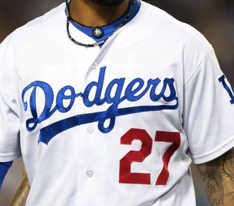
Hopefully we get a huge uniform update next year.
# 13
PsychoBulk @ 02/06/15 07:14 AM
The difference in the colour of the dirt and grass especially is staggering - far, far more lifelike and no longer washed out.
You know, I'm cool with people giving constructive criticism as I think it gives us a better product in the end, but this comment is just absurd.
|
|||||||||||||
|
All I see is improved coloring or just different shades,there is no graphical difference
You haven't seen the finished product and you are say there is no difference graphically , SMH !!!
# 17
merchant1874 @ 02/06/15 08:39 AM
|
|||||||||||||
|
|
|||||||||||||
|
Granted, if/when player models (the skeletal body and proportions, etc.) has an overhaul and they work toward some more authentic broadcast cameras (especially for fielding), I think it's going to be hard to look back and say that anything else would want big changes other than what you're referring to, which are probably textures/cloth physics.
This game was in desperate need of a change in the color and lighting system, though. It's too bad we didn't see any night game action in the video or screenshots yet, but I'm really itching at that hoping we can get something.
# 19
bronxbombers21325 @ 02/06/15 01:26 PM
Why can't we get rid of the sweat stains on hats?????????
When u get mad and start cursing these os moda get upset and ban you,I am gonna say thought,wtf is this attack a person for their comments board ?..does everything a person say have to please a fanboy,wth!! No I have not seen the real flking game,Im looking at the fking two picture comparison and making my fking opion on the the pics..there is no damn difference but colors that's what.i see and that's wtf I say!
Post A Comment


