Home
MLB 15 The Show News Post


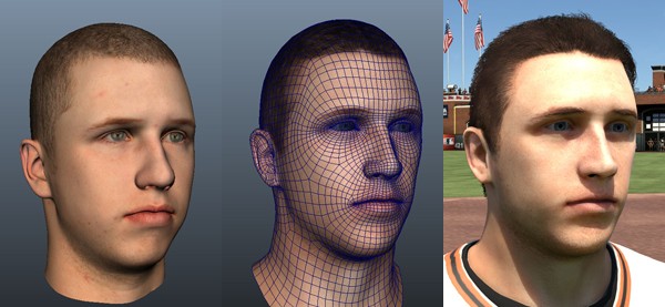
We have captured a bunch of MLB 15 The Show screenshots from the trailer that was released yesterday. While the quality isn't going to be as good coming from a video, these will have to do until we get actual in-game screenshots.

MLB 15 The Show screenshot gallery - Click to view MLB 15 The Show screenshot gallery - Click to view MLB 15 The Show screenshot gallery - Click to view MLB 15 The Show screenshot gallery - Click to view
Game: MLB 15 The ShowReader Score: 9/10 - Vote Now
Platform: PS Vita / PS3 / PS4Votes for game: 31 - View All
MLB 15 The Show Videos
Member Comments
# 41 ryanmc564 @ 12/11/14 01:29 PM
Quote:
Originally Posted by seanjeezy

I'm optimistic that the new skin tones also means higher quality skin textures on par with the face scans.

.


this is what I don't get when it comes to the face scans they do, this is probably one of my biggest gripes when it come to face scans or player models. but I'm more or less just curious on what happens in the process that the image on the left turns into the image on the right and why they are so different from each other.
 
# 42 seanjeezy @ 12/11/14 01:38 PM
The complexity of the geometry is probably different.

The funny thing is that neither version really looks like Buster. The updated version is better, but there's still something off about it. Looks like James Franco lol
 
# 43 ryanmc564 @ 12/11/14 01:53 PM
Quote:
Originally Posted by seanjeezy
The complexity of the geometry is probably different.

The funny thing is that neither version really looks like Buster. The updated version is better, but there's still something off about it. Looks like James Franco lol


lol, you're right, the image on the right does look more like james franco. damn that dude is in everything these days.
 
# 44 Sayheykid01 @ 12/11/14 02:08 PM
Looks like you'll be able to choose what webbing you want on your gloves this year, the Giant's pitcher looks like he has some sort of H web.

As for graphics, I'm going to go with the wait and see approach. Even though I would love new player models, I think that lighting can make a HUGE difference.

I think if they nail the lighting and improve the fluidity of animations in general, it can do wonders for the game.
 
# 45 countryboy @ 12/11/14 08:37 PM
I must be in the minority, because I personally think the game looks good. But then again, I grew playing Atari, Nintendo, and Sega Genesis.


And while the point will be overlooked and downplayed, with the game releasing on March 31st this year, when it released in May of last year, means the game has a shorter development cycle.
 
# 46 Jimmydm90 @ 12/11/14 09:05 PM
I recognize the posey on the left as buster posey but the model on the right looks like a somewhat cartoony generic create player with no resemblance to the SF catcher. Probably has a lot to do with the lighting. Also Create-a-Posey's nose, neck/jaw line and mouth are wrong.

I think emotive facial animations and life-like eyes (not the dead fish we've got now) would be HUGE help. The eyes are the worst part of the Puig trailer for me.
 
# 47 rudyjuly2 @ 12/12/14 06:06 AM
Quote:
Originally Posted by countryboy
And while the point will be overlooked and downplayed, with the game releasing on March 31st this year, when it released in May of last year, means the game has a shorter development cycle.
Madden had a short development cycle last year too releasing the next gen game 3 months later than normal but still saw a big improvement in graphics.
 
# 48 HustlinOwl @ 12/12/14 09:57 AM
Quote:
Originally Posted by rudyjuly2
Madden had a short development cycle last year too releasing the next gen game 3 months later than normal but still saw a big improvement in graphics.
yea and about 5 times the budget and dev team
 
# 49 nemesis04 @ 12/12/14 10:29 AM
Quote:
Originally Posted by Sayheykid01

As for graphics, I'm going to go with the wait and see approach. Even though I would love new player models, I think that lighting can make a HUGE difference.
When you say player model are you talking about skeletal proportions? Or is it skin tones, uniforms or their art interpretation as a whole? Just curious because I see people mention this a lot without specifics.
 
# 50 Blzer @ 12/12/14 10:48 AM
Quote:
Originally Posted by nemesis04
When you say player model are you talking about skeletal proportions? Or is it skin tones, uniforms or their art interpretation as a whole? Just curious because I see people mention this a lot without specifics.
I always mean skeletal proportions when I say that. But it also has largely to do with how the body scales and animates with it.

Since the PSX days of 989 developing this game, increasing the body weight has always felt like the player just gets stretched wide. It's hard to explain, but that's just what it feels like.

Arms aren't as stubby anymore (surely everyone knows my JP reference), but the upper body is still so stocky that the arms can't wrap around naturally still.

Heads are too big, legs are too small.

Somebody a very good interpretation using Freddie Freeman and re-molding his skeletal system. I'll do some digging.

New player models is a huge undertaking, though. Every animation is tied into their current skeletal system. Every animation would have to be redone, this includes batting stances and pitching motions.
 
# 51 merchant1874 @ 12/12/14 11:21 AM
Quote:
Originally Posted by nemesis04
When you say player model are you talking about skeletal proportions? Or is it skin tones, uniforms or their art interpretation as a whole? Just curious because I see people mention this a lot without specifics.

When I say it I mostly mean uniforms followed by skeletal proportions. The two probably go hand in hand though.

If they were just to make the uniforms better (better textures, better cloth physics, open/ closed buttons, logo scale on caps/sleeves) I think it would make a massive difference to the look of the game.
 
# 52 Turbojugend @ 12/12/14 11:48 AM
Quote:
Originally Posted by Blzer
Since the PSX days of 989 developing this game, increasing the body weight has always felt like the player just gets stretched wide. It's hard to explain, but that's just what it feels like.
Totally feel what you're saying here. Take Panda for instance, his model looks like they used a horizontal scaling tool to increase his girth.
 
# 53 Sayheykid01 @ 12/12/14 01:31 PM
Quote:
Originally Posted by nemesis04
When you say player model are you talking about skeletal proportions? Or is it skin tones, uniforms or their art interpretation as a whole? Just curious because I see people mention this a lot without specifics.

For me personally, I'm talking about the skeleton of a player. Like some others have said, it seems like the heavier players just have a larger torso which could be a big reason proportions look a little off.

I do think A LOT of this has to do with how the jerseys are interacting with the body. If the jerseys just "fell" a little more, I think it could make a huge difference in how the body types look.
 
# 54 Factzzz @ 12/12/14 03:23 PM
Quote:
Originally Posted by HustlinOwl
yea and about 5 times the budget and dev team
Didn't stop the Show from looking 2000x better on last gen, that's just an excuse.

Quote:
Originally Posted by nemesis04
When you say player model are you talking about skeletal proportions? Or is it skin tones, uniforms or their art interpretation as a whole? Just curious because I see people mention this a lot without specifics.
The main thing is giving players better body types (skeletal proportions) that match their real life selves better. It seems like they have three body types. There needs to be a lot more. Players like Sandoval (big belly), Darvish (long neck), Freeman and Heyward (long legs ands arms), and many many many more players body's don't like real life.

And the uniforms need to be a lot better too, different sizes, button options, and better "cloth physics."
 
# 55 thaSLAB @ 12/12/14 03:26 PM
Quote:
Originally Posted by HustlinOwl
yea and about 5 times the budget and dev team
QFT

htcONE [M8] | Tapatalk Pro
 
# 56 Factzzz @ 12/12/14 03:47 PM
Quote:
Originally Posted by Blzer
Somebody a very good interpretation using Freddie Freeman and re-molding his skeletal system. I'll do some digging.
I believe this is what you're looking for:
Quote:
Originally Posted by bodhiball
some visuals!

Using the assumption that they may be the same skeleton used in the PS4 version, I wanted to show some of what I THINK stands out to people still.

Though most of the proportions seem correct when I measure, there is a general feel of the players legs seeming short (especially from the knee down)..you can see this in the Verlander image) and large heads (you can see this in the Freeman model and players like Kershaw and others). There is also something in the hips, and the combination makes the models seem "boyish", more like cartoon versions of themselves. It's subtle, but it does show...again using the Freeman image as an example.

In the Freeman image I copied the player model in the third shot and made very minor adjustments....reduced the head size, gave him broader shoulders and reduced the "flare" of the sleeves, and slightly increased the overall length of the hips/legs. Its going to be a preference I understand, though to me the adjusted image looks more like a man, and more representative of Freeman.

In general there does not seem to be a range of "figures" or body compositions which allow easier identification of who is who. Looking at the Rollins comparison, he looks pretty buff, and glanced quickly even resembles more of a Ryan Howard model. Part of this is the shoulders, partly since there is no "clothing hang" the pants and jerseys seem more that the player fills them out fully...making them bulkier than they really are.

It's one of the things I am amazed with in NBA 2k14, that even from a distance you can recognize players just by their player model...different levels of bulk and tone, fat, muscle, skinny etc., and then of course the fact that their clothing hangs off of that model, allows for even more realism.

Dont know if this answers the question from the developer, or hopefully shows visually what sometimes stands out. I have the flu...I have way too much time on my hands right now.


# 57 HustlinOwl @ 12/12/14 04:38 PM
Quote:
Originally Posted by Factzzz
Didn't stop the Show from looking 2000x better on last gen, that's just an excuse.
lmao really youre going to go there, yea that was at the end of the life cycle of the PS3 and what 6+ years working with the hardware. Again all subjective enjoy your weekend
 
# 58 countryboy @ 12/12/14 05:27 PM
Quote:
Originally Posted by rudyjuly2
Madden had a short development cycle last year too releasing the next gen game 3 months later than normal but still saw a big improvement in graphics.
And The Show may have a big improvement in graphics as well. I guess we'll have to wait and see.
 
# 59 kehlis @ 12/12/14 05:56 PM
Let's not turn this into a comparison thread against other games please......
 
# 60 headzapp @ 12/12/14 07:33 PM
I like the new flags, and Dodger stadium looks better. The dugout looks like it has more detail. I hope other stadiums get upgrades like ballpark village in St. Louis. With backgrounds I wonder what it would look like to have real images of the back ground scenery. Like the mountains in L.A., Arch in St. Louis, and all the buildings. Just have night and day pictures, and add different skies to it.


Post A Comment
Only OS members can post comments
Please login or register to post a comment.