


 01:26 AM - August 29, 2014 by Steve_OS

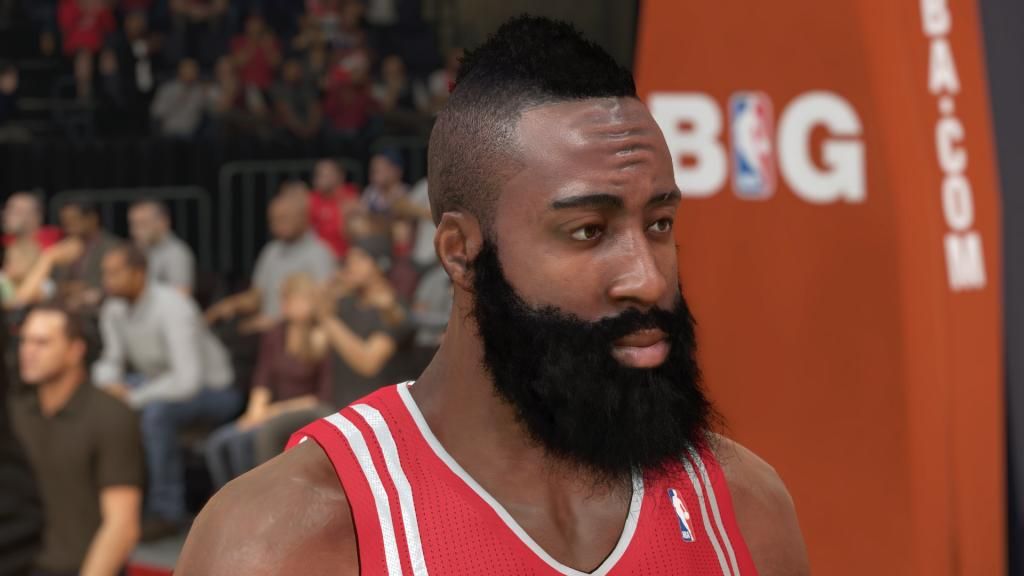
Steam has updated their NBA 2K15 page with screenshots of John Wall and James Harden. Your thoughts?
Thanks for the heads up @wetai30254!
01:26 AM - August 29, 2014 by Steve_OS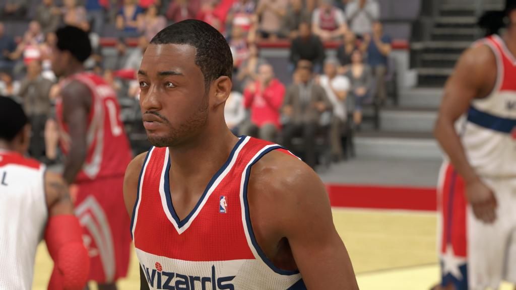
|
|||||||||||||
|
|
|||||||||||||
|
|
|||||||||||||
|
|
|||||||||||||
|
|
|||||||||||||
|


 Blogs Reviews Press Features Media

