Home
MLB 13 The Show News Post

Check out the first MLB 13 The Show screenshots. Looks like Nike is in, good eye bp4baseball and baseballin23!


Click here to see a higher resolution screenshot.
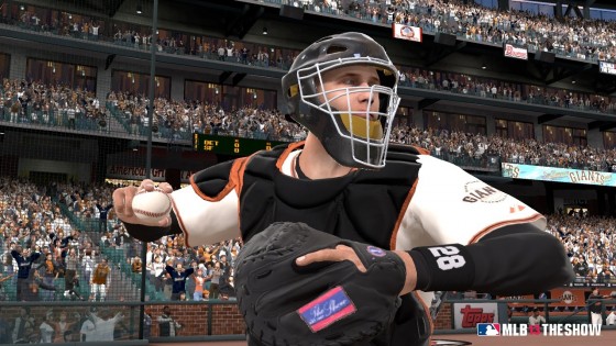

Click here to see a higher resolution screenshot.


Click here to see a higher resolution screenshot.


Click here to see a higher resolution screenshot.


Click here to see a higher resolution screenshot.

Game: MLB 13 The ShowReader Score: 9/10 - Vote Now
Platform: PS Vita / PS3Votes for game: 36 - View All
MLB 13 The Show Videos
Member Comments
# 1 bp4baseball @ 11/26/12 10:29 AM
Very first observation... We have the Nike logo :-)

I'm sure people will find more small additions

It's a great morning :-)
 
# 2 Flaxseed Oil @ 11/26/12 10:31 AM
Looks exactly the same as last year, which isn't a problem because the game is already beautiful.

I look forward to the feature list. I'd love it if every team didn't resign all of their players, so we actually had some decent free agents available in the offseason.
 
# 3 Lovesports @ 11/26/12 10:44 AM
Still no long hair on Andrew . Sleeves still look too big but other than those two small things, beautiful as always.
 
# 4 UMhester04 @ 11/26/12 11:00 AM
wheres the nike logo...
 
# 5 kt-od @ 11/26/12 11:02 AM
Quote:
Originally Posted by bp4baseball
Very first observation... We have the Nike logo :-)
Which picture did this appear? I still can't find it.
 
# 6 bp4baseball @ 11/26/12 11:05 AM
Quote:
Originally Posted by UMhester04
wheres the nike logo...
In the first shot on his undershirt right above the v of the jersey. Also if you go to the playstation blog (link in the playoff mode thread) there are two other shots which also show the logo
 
# 7 UMhester04 @ 11/26/12 11:08 AM
ah wow you must have found waldo a lot when you were younger huh?
 
# 8 kt-od @ 11/26/12 11:10 AM
Quote:
Originally Posted by bp4baseball
In the first shot on his undershirt right above the v of the jersey. Also if you go to the playstation blog (link in the playoff mode thread) there are two other shots which also show the logo
Wow... good find!
 
# 9 seanjeezy @ 11/26/12 11:22 AM
Hopefully the black mask for Posey means its customizable, the chest protector looks the same though, can't really tell from that angle...

Miggy seems to be wearing a new style of batting glove, Kemp is wearing one of the cleat styles from the Astros video, and the blue on the Jays uni still looks a shade too dark.

Its that time of year again, thanks Steve
 
# 10 bp4baseball @ 11/26/12 11:25 AM
Quote:
Originally Posted by UMhester04
ah wow you must have found waldo a lot when you were younger huh?
Ha ha no, just years of looking over Mlb the Show screenshots in the winter ;-)
 
# 11 crains13 @ 11/26/12 11:31 AM
Well its official...looks like from here on out its check OS everyday until '13 comes out.
 
# 12 bp4baseball @ 11/26/12 11:35 AM
Quote:
Originally Posted by crains13
Well its official...looks like from here on out its check OS everyday until '13 comes out.
Yep there goes my phone battery. I also like this time of year because generally we see more interaction from the developers which is always appreciated. Unfortunately we also see the ugly side of some people when they find out their feature didn't make the cut.
 
# 13 RoyalBoyle78 @ 11/26/12 11:39 AM
Very nice treat this morning!!!! I will say something though, I much more interested in the Vita version, please some Vita Screens San Diego
 
# 14 devroid @ 11/26/12 11:45 AM
Havent played in Toronto much before so I can't say if this is different or not but is that a closed roof?
 
# 15 davis420 @ 11/26/12 11:51 AM
If you look close in the Bautista shot, the scoreboard says Batista has hit 2 solo Home Runs but the scoreboard says the score is 0-0? Time to start the nitpicking! LOL
 
# 16 zkiesel @ 11/26/12 12:01 PM
Quote:
Originally Posted by devroid
Havent played in Toronto much before so I can't say if this is different or not but is that a closed roof?
That's been in there before. It's the portion of the roof that's always there and expands when the roof closes. See this picture from MLB 12: The Show: http://a.espncdn.com/photo/2011/1201/vg_mlb_8_576.jpg
 
# 17 Blzer @ 11/26/12 12:17 PM
I was thinking the same thing about the roof as well. Looks like we won't yet know for sure (the Matt Kemp shot isn't telling enough yet, either).

I do feel like one of these five will be our cover athlete, if not on the loading screens like The Show '12 had.

Textures essentially look the same, but time will tell what this behemoth will have to offer on other visual fronts.

Good looking out, SCEA! It's almost that time again.
 
# 18 Jakeness23 @ 11/26/12 12:32 PM
The sleeves do look a bit big still, but obviously that's not a huge issue or anything. This is definitely the best looking and best overall sports game out there.
 
# 19 thaSLAB @ 11/26/12 12:35 PM


Sent from my LTEvo using Tapatalk 2
 
# 20 Tyler4 @ 11/26/12 12:38 PM
Looks awesome guys! Can't wait for the release of '13! I really wanna how many batting stances/pitching styles have been added/updated! One of these years there's gotta be an option to pick two stances for switch hitters. Along with the option of pitching motions for pitchers, one from the windup and one from the stretch. Whether they're the same pitchers "signature motion" or a different.
Ex. Tim Lincecum's signature windup and Jon Lester's signature stretch motion.
 

« Previous1234567Next »

Post A Comment
Only OS members can post comments
Please login or register to post a comment.