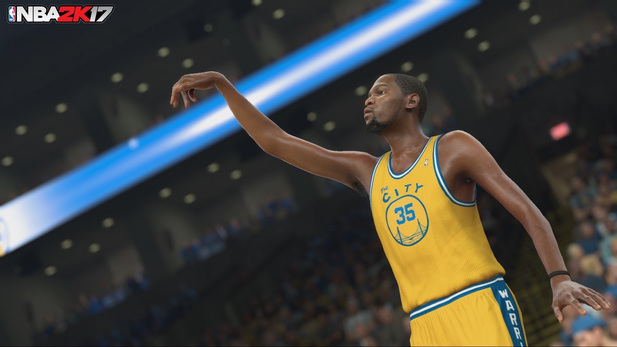
There are far more realistic deflections, less-than clean rebounds and more. The caroms are true to life after the ball hits the rim, the floor and even the floor. You can even do tip-ins or tip back rebounds.
Smart CPU opponents and teammates will make adjustments mid-game and even throughout the season if you’re playing MyGM and MyLeague.
There’s also a new way to choose freelance offenses on the fly.
A triangle will populate, and you can simply point the right stick in the direction of the look you’re ready to run. It’s much better than the wildly confusing system in NBA 2K16.
The pace of the game doesn’t feel hurried. It instead feels smoother and carries more of the symmetry that you see from NBA-level athletes. The speed thresholds are still proper and realistic, but every player felt quicker.
If true, THANK GOD. Along with passing, the sluggishness of the players (quickness, mind you, not necessarily straight line speed....think explosiveness) was one of my biggest gripes about recent 2K offerings. Everyone felt sluggish out of the gate, then garnered speed at an unrealistic rate. Hopefully I can feel/see that improvement as well. Any change in that area (locomotion) is a huge plus IMO.
Glad to hear that things are faster in 2k17. The slow execution in 2k16 was something that killed the realism for me a little bit. Sam Pham will be happy about that too.
Guys, if everything in this day's threads winds up playing as well as it sounds...
I will GLADLY live with the player models.
Would you rather have:
A game that plays beautifully both during and between games, but has clearly flawed player models?
Or a game with picture-perfect player models that plays like Cheetahmen 2?
The blue on the jersey is way off. Should be much darker. And the logo in the centre is too small. Needs to be fixed, one of the cleanest jerseys around...
This is what it should look like. Hopefully a patch can fix it.
I'm surprised you look at that comparison and focus on the blue color. For me the biggest issue is the TINY circle in the middle with the player number. It's smaller to an insulting degree...
I had to look up "Cheetahmen". Holy ish man. That has to be right up there with ninja turtles on NES. On track tho, the player models can mess with spacing if to large. Still waiting on that gameplay footage....
I'm surprised you look at that comparison and focus on the blue color. For me the biggest issue is the TINY circle in the middle with the player number. It's smaller to an insulting degree...
I agree that both mistakes are equally terrible, gun to my head I'd prefer the colour to be right as in general gameplay that'd stand out more. I'm really disappointed as these are my most liked jerseys in the league (maybe my bias) and they butchered it so bad on multiple fronts that I'll never wear them in the game.
I'm just waiting for non fanboys of this franchise to play this game and tell the difference, this franchise literally has more fanboys that claim you can tell the difference every year, when in reality, basically plays the same. Only then commentary nothing really excites me. I hope create a player is better and actually allow us to put tattoos on them, that was so lame last year, all these tattoo creations but wouldn't let you put a single tattoo on CAP.
Im keen to see how this dribbling system plays out.
The signature size ups are gone, which seems to indicate a loss of individual player style.
Yeah I speculated this also dude. A few of the guys tell me that it's confirmed still signature though. Just broken up (1 dribble move per directional input).
Whereas in 2K16 it was flick once for 3/4/5 moves (signature).
So again, I've been told by a few people on other threads it's apparently still signature. Just broken up.