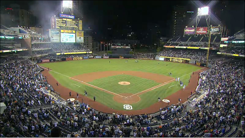
PETCO Park is definitely darker. I just saw pictures of it in the "Photographic side" thread.
For comparison's sake:
"Hey man, you're sitting in my nachos."
"Hey man, I'm a woman."
Actually the The Show pic is significantly darker. Is a glitch I'm guessing. Is like the people themselves don't get light reflected on them in The Show.
Actually the The Show pic is significantly darker. Is a glitch I'm guessing. Is like the people themselves don't get light reflected on them in The Show.
That's what I mean. PETCO Park in The Show is definitely darker than it should be as well.
As impressive as this game's lighting is, I still have a lot of lighting issues with this game that stems beyond the crowd being lit, but that's saved for another thread entirely.
Just wanted to say that from this video the graphical improvements are huge. I've spent the last month playing the PS3 version and it's night and day. For those that don't see a difference, I feel sorry for you cause it looks beautiful.
As for the lighting issues, folks please understand that stadiums live and in person look different then they do on TV. On TV everything is bright and very well lit due to incredible lenses being used for presentation. In person (I've been to 6 different stadiums) I would lean more towards the darker shadowing then an all bright field and stands. Not to say it's perfect but it's not too far off.
As for the lighting issues, folks please understand that stadiums live and in person look different then they do on TV. On TV everything is bright and very well lit due to incredible lenses being used for presentation. In person (I've been to 6 different stadiums) I would lean more towards the darker shadowing then an all bright field and stands. Not to say it's perfect but it's not too far off.
I agree with this. Although I think it's a little too dark in some areas, it's not as drastic as some people may think it is. I'm thinking back to games I've gone to at Camden Yards, and the crowd is definitely not as well lit as the field, but it's never pitch black.... So I still think it's an issue, but it's not quite as drastic as some people think.
As for the lighting issues, folks please understand that stadiums live and in person look different then they do on TV. On TV everything is bright and very well lit due to incredible lenses being used for presentation. In person (I've been to 6 different stadiums) I would lean more towards the darker shadowing then an all bright field and stands. Not to say it's perfect but it's not too far off.
Let's not do this.
Yes, I know what real parks are like versus TV. Please don't excuse them or defend them for what they have in these few parks.
This game has stadium-to-stadium differences. You can't excuse them all if it's not consistent.
Sorry, my post is coming from this large culmination of posts that always defend something that is wrong with the game, it's not you personally. This "old build" stuff that I always hear, "really compressed" and stuff like that normally just doesn't cut it for things that still linger after release.
That being said, let's hope all lighting issues/concerns/faults are taken care of by next year.
Is the Pirates' "P" logo supposed to have a black center? It looks really bad on a yellow background.
Also, why is the Pirates' "buccaneer" logo shown when Lirano's starts brought up? It has been retired for the "P" logo. Or does that just show alternate logos?
After researching, accoridng to Chris Creamer's logo website, the P shouldn't have a black center and the "buccaneer" logo is no longer used in any form. That's pretty sloppy.


 09:49 AM - May 5, 2014 by HustlinOwl