NCAA Football 12 News Post
NCAA Football 12 Videos
Member Comments
Still have the QB with his arm straight up in the air like he has no shoulder pads on. I'm sure folks won't be happy about that. But overall it looks good.
# 2
JSU SWAC Champs07 @ 05/19/11 11:34 AM
Not going to nitpick PRESENTATION looks great.........but the real news comes on May 23rd

# 3
jeremym480 @ 05/19/11 11:47 AM
Wow, those players running behind the horses are really fast 
J/K Everything looks great!

J/K Everything looks great!
Blah. More of the same just with horses. It's not the visuals that need to be improved it's the commentary. It's just so boring with no substance to the game. Was hoping for more dynamic pre-game commentary.
|
|||||||||||||
|
It's the commentary and the camera angles they need to change. They need some wide angle shots of the stadium more and the commentary needs to fluidly run from intro to the coin flip.
As it stands it is too choppy and the camera angles are all tight and make you feel like everything is on a much smaller scale.
It's just boring and bland. Sorry. I love this game and still play NCAA 11, but if I wanted presentation I would not look to this game at all.
Go to 1.52 of this video and look at the camera angles -- don't worry so much about the commentary, but notice the wide angle shots.
http://www.youtube.com/watch?v=pbtkQ...eature=related
# 8
TheGamingChef @ 05/19/11 12:05 PM
I liked it a lot. I felt that it didn't add a whole lot over last year, but what it did add and change made the experience more satisfying.
# 9
COACH WEBB @ 05/19/11 12:08 PM
It would be sweet if they added the Saturday Night ESPN Primetime package. I liked the video though.
# 10
huskerwr38 @ 05/19/11 12:13 PM
I really like what they have done with the intros and presentation. However, the camera angles and tight shots are horrible. At one point with the shot of the wagon and horses all you see are the wagon wheels the shot is so close. Fix those camera angles and it will be 100% authentic.
The marching bands on the fields still feel off and stale. I doubt they were changed at all. Does every school really love USA that much? Put OSU's dotting the I in and get closer to the action for other schools. And as was pointed out, the QB dancing a jig like he forgot to use the bathroom before getting suited up is laughable and takes you out of the experience.
Pumped for the game though.
Pumped for the game though.
# 12
chrisphil1724 @ 05/19/11 12:27 PM
Great video! Almost was great as Coke Zero! Real Coke taste with zero calories!
# 13
Bfreecloud @ 05/19/11 12:40 PM
very slow pacing. where are the dynamics? the storylines? field conditions or anything that makes it feel like a live event?
people will just skip through the presentation anyway.
people will just skip through the presentation anyway.
Not bad. Assuming they updated Dynasty and RTG this year, Dynamic Commentary has to be the next step. Unless you just turn it off, it kind of kills the buzz no matter how well put together the rest of the stuff is. As we hear the same lines over and over, it just reminds us that we aren't having a true broadcast experience.
I'd like, but don't need, more commentary teams. Two or three (ABC, ESPN, CBS). Obviously it can be done, but it is such a big feature to implement, I wouldn't be mad if they couldn't do it on a year where they really updated Dynasty and RTG. Hopefully that is the case this year, because the Presentation itself isn't going to carry the game.
I'd like, but don't need, more commentary teams. Two or three (ABC, ESPN, CBS). Obviously it can be done, but it is such a big feature to implement, I wouldn't be mad if they couldn't do it on a year where they really updated Dynasty and RTG. Hopefully that is the case this year, because the Presentation itself isn't going to carry the game.
|
|||||||||||||
|
These intros are a nice touch, but ultimately the improvements in the gameplay are all that matter to me. I want to see how the game performs on the field this year. And speaking of performing ... Old Spice Red Zone. When performance matters most!
|
|||||||||||||
|
|
|||||||||||||
|
That video is not accurate to real life. The Schooner does not lead the team out of the tunnel in real life, but rather runs out of the tunnel in northeast endzone after all the the band has finished playing, but before the players enter the field.
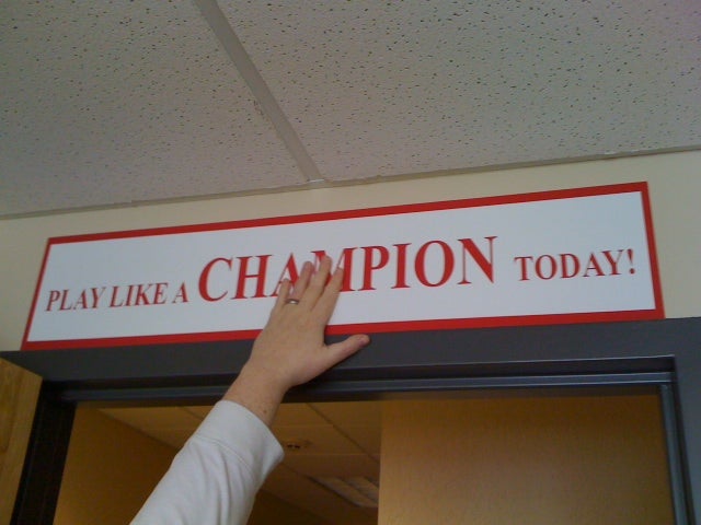
They also missed a big part of the pre-game thing that the players do when leaving the locker room, which is touching a "Play Like a Champion Today" sign that is posted just outside the locker room.
http://www.soonersports.com/trads/pl...-champion.html

The Schooner is more of a big deal during games after scores than it is during pre-game.
They also missed a big part of the pre-game thing that the players do when leaving the locker room, which is touching a "Play Like a Champion Today" sign that is posted just outside the locker room.
http://www.soonersports.com/trads/pl...-champion.html

The Schooner is more of a big deal during games after scores than it is during pre-game.
|
|||||||||||||
|
# 20
SlickRick11 @ 05/19/11 01:15 PM
overall it looks good.....I've seen so many videos on pregame and presentation that im just curious about the gameplay at this point.....it is definitely an upgrade from last year though but the commentary really needs some work..... I wish they would have put oklahoma st. at home though because they've already had previous videos of the boomer schooner leading oklahoma out onto the field.....oh well waiting for the 23rd
Post A Comment


 11:29 AM - May 19, 2011 by Steve_OS


