 07:50 PM - March 4, 2011 by Steve_OS
MLB 11 The Show News Post
 07:50 PM - March 4, 2011 by Steve_OS
MLB 11 The Show Videos
Member Comments
# 1
CookieRojas1 @ 03/04/11 08:39 PM
Kauffman Stadium looks beautiful and the video board in center looks spot-on.
Well right off the bat they got U.S Cellular wrong, way too many people in the stands, should be just under half full 
Man they all look gorgeous!

Man they all look gorgeous!
# 3
JoeCoolMan24 @ 03/05/11 01:36 AM
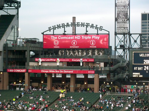
The thing that stands out the most to me is the Fundamentals Deck at US Cellular Field.
For the past couple seasons, Comcast has been the advertisment on it, therefor they have not had a car up since 2009. Also, there are a couple pilars missing in the middle....
Pause the video at 0:42ish to see the fundamentals deck and the differences.

For the past couple seasons, Comcast has been the advertisment on it, therefor they have not had a car up since 2009. Also, there are a couple pilars missing in the middle....
Pause the video at 0:42ish to see the fundamentals deck and the differences.

# 4
ImBaconBeckham @ 03/05/11 02:36 AM
|
|||||||||||||
|
NOT REALISTIC ENOUGH!

# 5
ScubaXsniper @ 03/05/11 10:58 AM
When I first looked at that picture, I thought that was the game, and I was like, "HOLY $&#@!" Then I watched the video and was like wow...
# 6
JermaineDye05 @ 03/05/11 11:14 AM
Looks like they may have underrated Alexei Ramierz's defense this year. I'll have to tweak that once I get the game.
# 9
ScubaXsniper @ 03/05/11 02:52 PM
|
|||||||||||||
|
# 10
markpmitch @ 03/05/11 03:37 PM
Indians new road uniforms are already wrong.. yay MLB style guides 

# 11
Nexgenrulz @ 03/05/11 04:27 PM
|
|||||||||||||
|
# 12
merchant1874 @ 03/05/11 08:14 PM
They all look beautiful!
One teeny thing I've always disliked however is at comerica park where you can see ford field it says THE SHOW! Instead of ford field. I realise they don't have rights but would be better blank in my opinion.
One teeny thing I've always disliked however is at comerica park where you can see ford field it says THE SHOW! Instead of ford field. I realise they don't have rights but would be better blank in my opinion.
# 13
markpmitch @ 03/05/11 08:36 PM
Yeah, the blue outline by the buttons. Not a big deal, but not difficult to get right either
# 14
Nexgenrulz @ 03/05/11 11:17 PM
|
|||||||||||||
|
# 15
markpmitch @ 03/06/11 10:11 AM
|
|||||||||||||
|
# 16
eremiomania @ 03/06/11 12:49 PM
I try not to complain, this years game looks awesome, but I can't believe they still haven't updated the otherside of the CF wall at Progressive field. That picnic area with the trees was converted into a HOF years ago now. Also, there is a big bar out there now too that has been there over a year.
# 17
HandsomeJack @ 03/07/11 04:08 AM
A few observations from a Twins fan: 1) The trees have been removed from behind the center field wall at Target Field--though as this only happened a few weeks ago I can understand that it isn't represented in game yet. B) The Twins road uni's have a stripe on the pants. I've always rolled my eyes a little at people that complain about uniforms but that stripe, as simple as it may seem, adds a lot visually. Without it they just wear plain gray pants, which is monumentally boring to me. 3) Attendance was an issue last season as well, and I'll be disheartened if it isn't fixed in this year's game. The Twins sold out every home game last year, and will again this year, and yet I played most of my games in a half empty stadium, which negatively affected my immersion in the game and made the "atmosphere" much less exciting. P.S. I won the division, so the low attendance had nothing to do with my performance.
Post A Comment


