 Submitted on: 09/16/2015 by
Brandon Kosal

The NFL season has finally begun, and by now, all the Madden junkies have had ample time to gobble up the game. Now we’re in the digestion period where opinions are being formed and potential improvements to Madden 17 are already being thought about. So in order to break up the tension a bit, it’s time to discuss what really matters: uniforms. Here is a light-hearted, please-don’t-take-this-too-personally-or-seriously look at the three best and worst uniforms in Madden 16.

Arizona Cardinals - Official Alternate
Maybe it’s the simplicity. Maybe it’s the intimidation factor. I don’t know what it is, but there’s something about an all-black uniform that strikes me. Primary black with secondary colors red and white play nice together here, with nothing feeling out of place or unwanted. The standard helmet works well here with the all-black uniform, with the Cardinal itself adding a nice touch of red. Nicely done, Arizona.

St. Louis Rams - Official Alternate Classic
Are you kidding me? Where do I sign up? The thought of being able to one day wear this jersey is almost enough to get me to try and walk-on to an NFL team one day. Yellow pants have no business working in any circumstance. And they barely get a passing grade here, but for some reason, it works well with this particular shade of blue. And that helmet? Come on! That might be my favorite helmet in the entire game. Big thumbs up here, St. Louis. Perhaps one day you’ll once again field a team that lives up to the greatness of these jerseys.

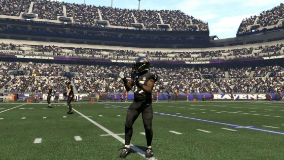
Baltimore Ravens - Official Alternate
I suppose I’m showing my hand here a bit, because this uniform does follow the same pattern as the Cardinals’ official alternate uniform. But Baltimore took things a step further with the all-black theme. Aside from the white numbers, black is really the only color you see. And much like Arizona’s, the Ravens’ logo blends well with the colors in this uniform. Purple and black is a great color combination in any context, but in football? Even better.

Cincinnati Bengals - Official Alternate
Here’s a serious question. If the Bengals had to design a Halloween-themed uniform, what would they do differently? If you asked a 4-year-old child to color a picture of a football uniform, it’d probably look something like this. Orange, black and white are intermingling with no rhyme or reason whatsoever. This is actually a great color combination, so how the Bengals managed to butcher this one so bad, I’ll never know. Football fans and the spirit of Halloween both deserve better.

Miami Dolphins - Home Alternate
It’s not that this design is too simple. As you saw earlier, I reward simplicity. It’s just that the color they used to celebrate simplicity was...not the right choice. Find a big enough lineman churning along in this thing and it will look like an aquarium is marching down the field. Also, spoiler alert: an aquatic teal-ish color does not mesh well with orange. People love to visit Miami, but more bad decisions such as this uniform will reverse that trend in a hurry.

Pittsburgh Steelers - Official Alternate Classic
WARNING: This image may cause dry heaving. So this style was apparently a thing back in 1933, which sort of makes you feel grateful that color television held out until the '50s. You have to wonder about the people who green-lit this design back in the day and what other decisions they made that negatively impacted others. The fact that the Steelers brought this back into relevance has to fall under the “it’s so bad, it’s good” category. Simply put, folks who use this jersey online should have to spot their opponent a touchdown.


